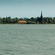
mihaela2006.09.02 [14:25]
and also the tiny church is a more focused in both, as can be seen
mihaela2006.09.02 [14:19]
and your colours also are so nice :)
I will try to be more familiar with PS!
mihaela2006.09.02 [14:17]
thank you very much Wojtek, they are very nice, I like them! :)
you are right, the photo should need some more crop
I like a little more the second one, the highest!
vadol2006.09.02 [11:16]
Dear Mihaela
I send to you two propositions of "cutting" of this photo.
What dou think about it? The same photo, but i think two different point of vieu.
pozdawiam wojtek
vadol2006.09.02 [10:44]
Wrong composition, flat colours, wanishing church - this is only problem of taste? I write not about taste - i write about technical and artistic quality. For example if you need nice colour of sky - use polar filter(is this taste?), on this picture is too much flat sky, water is more interesting - you sholud change area fo photo - cut 2/3 part of sky.
pozdrawiam wojtek
mihaela2006.09.02 [09:31]
and All the best to you!
mihaela2006.09.02 [09:23]
ok, Wojtek. well, I see it is a problem of taste, mainly :)
and I couldn't wait for another moment, is another town, I was just passing
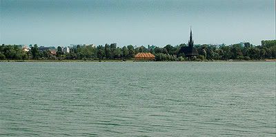
vadol2006.09.02 [00:16]
Propably this is beutiful place, beautyful landscape, but on this picture i cant see this.
This is in my opinion average photo - nothing more nothing less. why? i dont like in this picture for example:
1. composition half to half, sky/water this is not good solution to landscape photography
2. colours of sky and water: flat, without interesting light or colours.
3. if you would to show so many sky in photo (half of all area of photo), wait for interesting clouds, sunrise or something.
4. church in this photo is to small
pozdrawiam wojtek
mihaela2006.08.31 [22:21]
thanks Andrzej! May God help you to see it :) it is so nice :)
pieuczy2006.08.31 [10:20]
chcialbym to zobaczyc, Michaela super foto!!! pozdrawiam!!!