jovana2006.08.03 [20:41]
Нерадо гласам за црно белу варијанту!!!Поздрав!!
GuliVar2006.08.03 [18:14]
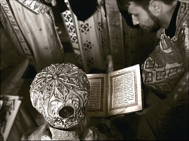
И по мени је Ц/Б верзија јача. Уз Бацкову сугестију имам још једну. Све ове изразито црне површине (испред лица ђакона,на ивици рукава ђакона,у горње делу две црне површине које излазе из кадра,лево на ивици главе владике) треба клонирати.
lazar2006.08.03 [13:45]
Alik it is monk standing in front of Deacon and black stain is his "Pana" ( I don't know English word for black kerchief ) but during treatment of photo with PS something happened with her . I will solve that problem. Table is disturbing I see, it can be solved too, just blur on mitra is not possible to change . Focus is on the book and it is general idea of the photo :).
Miha you have same cogitation as me , but now I am closer to B&W version. : ))
Backo hvala na komentaru, astalče će da popije "gradijent". Što se blura na mitri tiče tu nema pomoći, meni nije toliko smetao da zbog njega ne uzmem u rad ovaj meni jako zanimljiv kadar :)
Andrei I make color version with idea to give to book more important position with bigger size on the photo, but like you say book is more in the center of attention in B/W version . Sharpness and contrast are stronger on the book then in rest of the photo on both versions but this difference is more obviously in B/W.
Pawel (Haydamak) thanks for comment. I agree with you. When I think about what you say for BW pictures I see that in last time almost all my pictures are in sepia or bw :)))
lazar2006.08.03 [12:53]
Thanks dear friends I reading all remarks and comments very carefully and I find out that they are very useful and some of them I will implement in final version :)))
lazar2006.08.03 [12:47]
wiaczeslaw thank you very much, my mistake :))
wiaczeslaw2006.08.03 [11:18]
it`s not a gospel. it`s bishops`s liturgy book :)
alik2006.08.03 [09:35]
in both versions I don't like that archibishop mitra is so blury. It is more visible on closer one. on another one table is disturbing a little bitbut I like face of deacon holding bible - so probably I will make different cropp more square. But there is something strange around deacon - black stain?
mihaela2006.08.03 [08:20]
Hi Lazar! I don't know also, I like them both too :)
I like the second because of the more general view
and I like first because of warm colours, and the gospel remembers me of old Romanian gospels printed with kirilic letters, miniatures, traditional motifs and first big letter in red colour :), so I vote for first.
b.backovic2006.08.03 [08:06]
Лично бих одабрао доњу верзију јер се неоштрина толико непримећује, а и овај млади ђакон, који држи јеванђеље, је део садржаја фотографије, смета ми једино део у лавом доњем углу, требало би га затамнити, али не сасвим. Тако би јеванђеље било главни садржај фотографије, што је судећи по називу порука аутора. Поздрав!
andreicosmovic2006.08.03 [07:43]
In my opinion, in this case, the b/w photo is better, for it has a complete message, comparing to the color one through the photo. And also, in the b/w photo, the book is really in the centre of the attention.
Haydamak2006.08.03 [07:39]
Lazare, I think 2nd version is better because sharpness of "mitra" on the 1st version is very glaring, also 2nd has got larger point of view and it's without colour. Last time I have started to like black-white photos, I don't know really why :).
I am marking this second photo, pozdrav!
Lekovicl2006.08.03 [02:22]
Second version, what is your opinion :)